For our final Interpretive assignment, Thom asked my third year class to illustrate a cowboy. It was our second self-directed project of the year. Often these sort of tasks exert an additional degree of pressure. They indicate the direction of our personal style. Given that the majority of my work focuses on the ideal, and most of my male representations resemble cherubs...I chose to depict the cowboy as an idealized hero. A parody of Michelangelo's David became the product of these musings. It was fun to make. The Good, The Bad and the Ugly resounded on my computer speakers while I was developing early sketches.
I am not particularly satisfied with the outcome. It was also executed on major time constriction. As a result, I was unable to finish my quintessential spaghetti western landscape for the background. The integration of digital/traditional media did not go as seamless as I'd planned. With some practice, I'm sure my digital paintings will successfully imitate the tactile beauty of my beloved traditional media. I've made slight post-marking corrections since..note the manly changes :).
Monday, May 2, 2011
Night at the Museum--Final Animation
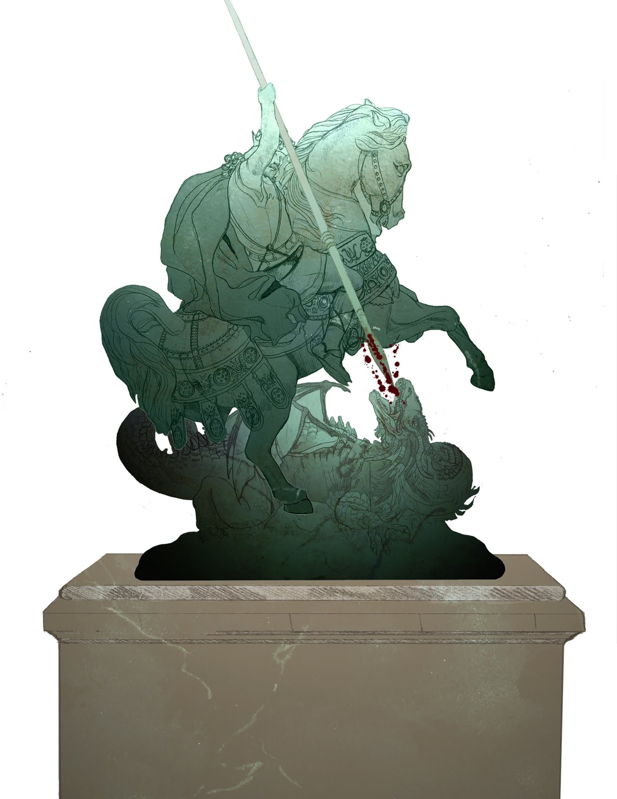
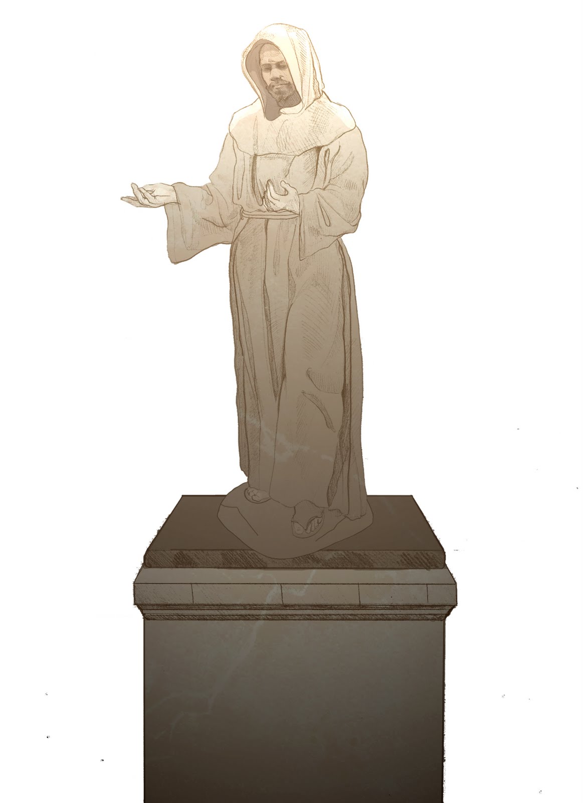
For weeks I had given thought to the subject of my final animation for Hyein's class. My original intent was to develop and animate the narrative behind one of my earlier pieces this year, 'The Goodbye', but found that the degree of work involved exceeded my technical knowledge and skill. So, as is habitual with me, I thought that I'd move toward a more simpler idea...which ended up being just as complicated as the former :P. Inspired by the Sculpture Room scene at Pemberly from the 2005 Joe Wright film, Pride and Prejudice, I decided to create an animation of sculptures springing to life in 3D. I had little experience in working with the Adobe After Effects 3D camera. I overlooked the fact that 3D cameras manouvre flat imagery to resemble paper theatre in 3D space. Rather, I started drawing multiple sculpture views to give the illusion of a rotating axis surrounding each character. Given the end-of-semester time constraint, I wasn't able to complete the animation to the extent that I would have liked. Nevertheless, I learned a great deal. After Effects and I are no longer enemies..for the present :P
Vimeo link to animation: link
Here are a few digital sketches and paintings featured in the final video:
Vimeo link to animation: link
Here are a few digital sketches and paintings featured in the final video:
More Lemurs!
A poster inspired by my bottle design for Peek and Seek fruit juice. I created at least five different versions of the poster before I settled on this design for final submission. I am not accustomed to working with Illustrator all that much for my personal artwork. The vector style of these lemurs is a far departure from my intensely detailed hand-renderings. I don't suspect that I'll be working with this style in the near future. Nonetheless, it was a nice exercise in shape simplicity.
Sunday, May 1, 2011
PEEK and SEEK--Final Label Design
Bottle design catered to children who entreat the purse of their brand-loving parents for the latest trend-setting products. For the 'Peek and Seek' theme, I chose to work with playful lemurs as my mascots. The bamboo background and overall colour scheme would imply that the beverage itself is a healthy choice.
Tuesday, April 12, 2011
PEN Canada Campaign Part II
"Then said David to the Philistine,Thou comest to me with a sword, and with a spear, and with a shield: but I come to thee in the name of the LORD of hosts, God of the armies of Israel, whom thou hast defied...And it came to pass, when the Philistine arose, and came, and drew nigh to meet David, that David hastened, and ran toward the army to meet the Philistine. And David put his hand in his bag, and took thence a stone, and slang it, and smote the Philistine in his forehead, that the stone sunk into his forehead; and he fell upon his face to the earth."
Samuel I: 45, 48-49
The second part of a mock illustration campaign for PEN Canada, a mailer. After several trials, I worked with the slingshot to promote an optimistic message regarding free expression, especially when applied to politically active women in dictatorial regimes. Unlike any other weapon, the slingshot is a powerful symbol. It was the means used by the Biblical David to defeat the menacing giant Goliath. With the slingshot, she is “throwing words in her defense” or rather employing 'words as her weapons'. I abandoned an earlier idea that involved the act of stoning because I started to re-evaluate the extent of damage caused by having one’s rights revoked as opposed to physical abuse itself. There is no contest. Loss of freedom is far worse than temporal physical harm. Rather than deflecting stones being thrown at her, her words are her stone/weapon. The slingshot is the catalyst to releasing this unstoppable force of expression, like physics with a stone.
We were asked to produce a potential merchandise item that reflected the aesthetic of our poster design. Given the convenience of its shape, I chose to represent my Burqa woman on a Russian doll which encases pens.
My faithful companion in all of this, despite being of little help? My tubby feline Mia. She woke to greet me for every morning of intense painting.
Samuel I: 45, 48-49
The second part of a mock illustration campaign for PEN Canada, a mailer. After several trials, I worked with the slingshot to promote an optimistic message regarding free expression, especially when applied to politically active women in dictatorial regimes. Unlike any other weapon, the slingshot is a powerful symbol. It was the means used by the Biblical David to defeat the menacing giant Goliath. With the slingshot, she is “throwing words in her defense” or rather employing 'words as her weapons'. I abandoned an earlier idea that involved the act of stoning because I started to re-evaluate the extent of damage caused by having one’s rights revoked as opposed to physical abuse itself. There is no contest. Loss of freedom is far worse than temporal physical harm. Rather than deflecting stones being thrown at her, her words are her stone/weapon. The slingshot is the catalyst to releasing this unstoppable force of expression, like physics with a stone.
We were asked to produce a potential merchandise item that reflected the aesthetic of our poster design. Given the convenience of its shape, I chose to represent my Burqa woman on a Russian doll which encases pens.
My faithful companion in all of this, despite being of little help? My tubby feline Mia. She woke to greet me for every morning of intense painting.
Wednesday, March 30, 2011
PEN Canada Campaign Poster
A mock poster campaign designed for the independent, non-profit organization PEN Canada . PEN Canada is committed to defending freedom of opinion and peaceable expression on behalf of writers worldwide who are mortally persecuted for elucidating necessary truths. The authors and journalists they support confront a variety of dangers for their craft. They often become embroiled into wars, imprisoned, exiled, live as refugees and are intimidated by tyrannical government regimes/gangs. Even in democratic countries, writers are the target of censorship. Despite being stifled in their native homeland, their voices must be heard and their passion for communication undeterred. On November 15, PEN Canada honours the Day of the Imprisoned Writer. In November 2005, one of these honoured victims was Roya Toloui, a Kurdish journalist, human rights activist and feminist. After discovering a very unsettling interview about the horrors she experienced in an Iranian prison, I chose to make her plight to subject of my poster. Simple enough, the silhouette created by a woman in a burqa (in essence, a mobile prison and global symbol of male subjugation) is fitted with a damaged letter containing the wise words of Toloui who exhorts politically active Iranian women to be fearless link.
This painting was a nightmare to complete. I aimed for a fully traditional rendering which included the figure, background and calligraphy. I had no intention of doing the type digitally in fear of losing the integrity of flawed handwritten script. Well…after placing a graphite transfer on the painting and trying to ink the letters in…I made countless mistakes and my hopeful experiment failed. I was forced to re-paint a good quarter of the figure over again. Alas, I was unable to correct the imprint of the type beneath the newly applied layers of paint. After my merciful professor allowed for an extension, I used a buddy combination of Photoshop and Illustrator to salvage the piece :). As for the Islamic wedding henna on the girl’s hand, I referenced photos of original henna designs that my friend Rachael had done for me. Thank you for your artistry Rachael :)
Tuesday, March 8, 2011
Ivan and the Chestnut Horse
After sifting through a book on Edmund Dulac’s fairytale illustrations nearly two years ago, I came across his beautiful rendition of the Russian folk tale ‘Ivan and the Chestnut Horse’. Dulac’s image, rendered in a style strongly reminiscent of Russian iconography, depicts the climactic moment when Ivan prompts his steed to fly to the extremity of Helena the Fair’s tower and the couple share a kiss link. I am naturally drawn to historical romances, so it was no doubt that Ivan and the Chestnut Horse would catch my immediate interest. The story recognizes several interwoven themes of love, loyalty, responsibility and above all, intuition. You have a son struggling to fulfill the dying wishes of his father, a demeaning set of arrogant brothers and a princess who wills her own captivity so that she might become the prize to a bridegroom who accepts the challenge of liberating her.
I sought to combine all these narrative elements into a single illustration that made exclusive use of negative shapes. I turned to optical illusion as an ideal form of visual communication. By juxtaposing the royal couple with the silhouette of a horse in profile, I learned the importance of balancing value and creating colour associations. Plenty of my research was devoted to accurately representing the elaborate clothing from the age of Russian Imperialism. I sense that the greater part of my work in the future will deal with the history and folklore of world cultures. In recent years I’ve enjoyed studying the histories of various countries, notably Italy , England , Poland and Russia .
Two-part reading of 'Ivan and the Chestnut Horse':
An initial sketch for 'Ivan and the Chestnut Horse', a variation of the Edmund Dulac scene.
Subscribe to:
Posts (Atom)